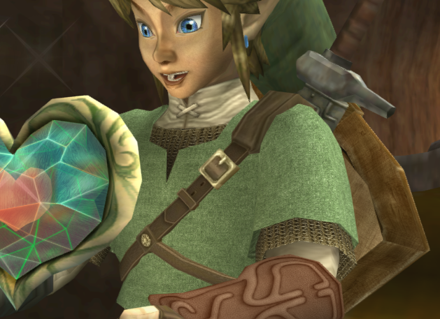
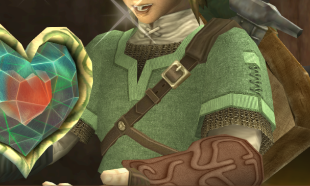
As I said in a comment on a previous post, I want to show a bit more of what goes into my textures. I've done the first part of the Hero's Tunic, and I'd like to share the steps it took to get it there. Remember, I welcome comments, If you see something I missed, or have an idea to improve a texture, let me know. I may just implement it.
I started with a piece of denim. I changed the hue to match the color, and I made sure that it was consistent so it didn't feel blotchy or tiled.
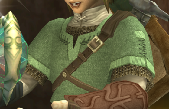
This may not seem like much, but its an important step. I blurred the texture a bit to help relieve the aliasing problem which becomes more apparent at a distance.
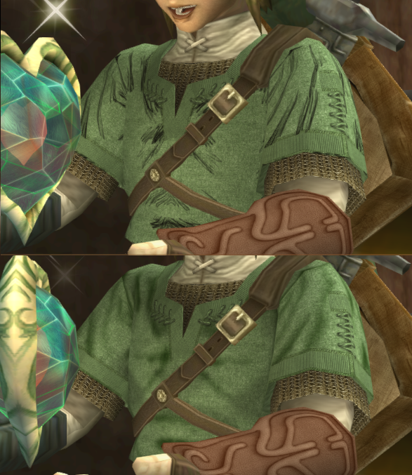
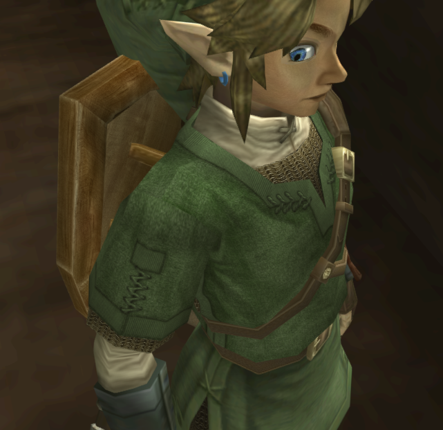
Now this next step was where I started adding the other fabric used around the edges of the tunic. The type of fabric I used doesn't perfectly match the game (which was smooth), however I do get a little bit of artistic freedom. I'm also going for realism, and I think that a more durable fabric would have been used on the edges of the clothing. Let me know in the comments if you disagree, and what you would do if that is the case.
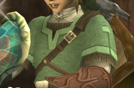
Finished the edges and added some stitching to hold it all together.
Can't forget the stitching!
More Stitching!
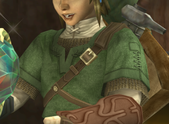
And here we start adding the first of many many many different shadings.
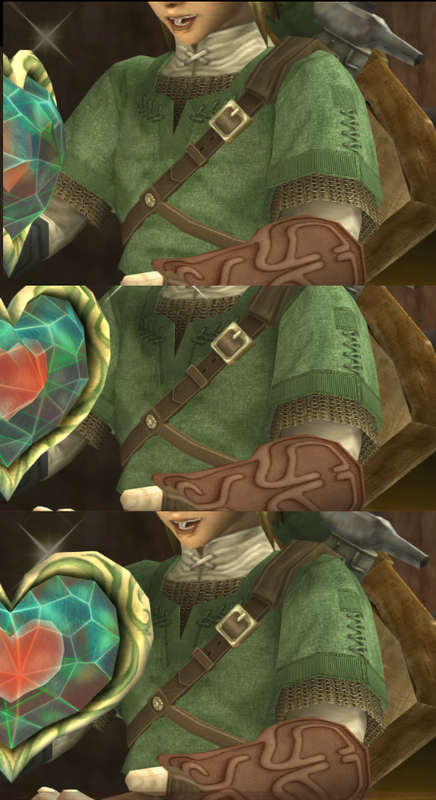
Continuing to refine...
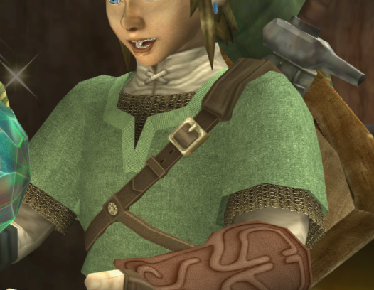
After darkening under the stitches to make them feel more grounded, then rest of the tunic was just too light. I had to make some adjustments to balance it out.
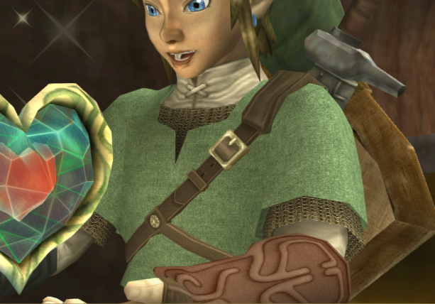
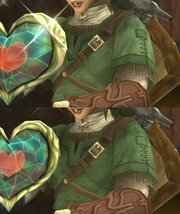
After a bit more shadow correcting, and a few more details fixed under the arms we have the final texture.
The final texture looks great. I wouldn't have used denim as a base but from the screens, the details on the denim end up just becoming background noise anyway so it looks good regardless. I probably wouldn't have gone with that vertical lines pattern for the edge material, either; looks a little too native american imo.
Clothing in the middle ages was mostly made from wool and linen, so that is what I would have used for my base. The way you blurred and blended them together still looks great, though, and the final product with all the shading is beautiful, certainly fitting of our hero.
One thing I've been meaning to mention: Nintendo gave Link green chainmail in Twilight Princess, but I've always felt like part of that was laziness due to the chainmail being such a small detail on the outfit. At higher resolution, the bits of mail hanging out of his tunic are way more noticeable, and green metal links are really weird. I'm hoping you take some cues from Link's design in Skyward Sword here; his chainmail in that game is gray and it looks a lot better.
It was playing Skyward Sword that really made me realize how weird Twilight Princess Link's green chainmail was, actually.
Reply
StepDragon
11/1/2014 11:56:27 am
I'm not at my computer right now so I can't check myself, but I've never heard of his chainmail being green. It was bronze in the textures I dumped and that's how I made the new texture. Even in the concept art, it's bronze.
The decision to use denim is for a couple of reasons. 1. Larger knit cloth creates more noticeable tiling patterns. 2. Any texture that isn't consistent would need to be very large to be readable, in which case it wouldn't fit the in game scale. And 3, it one doesn't perfectly mesh warp a hatched texture (such as larger thread cloth) it looks very robotic.
Because, as you said, it blends in, the denim is fine. Do you have a source texture as an example of what you would do for the edges? What I chose was one of the only things I could find that didn't make it look like it would fall apart.
Ah, it's bronze. I'm a tad colorblind so sometimes I get these things wrong. It's a serious handicap when you're enthusiastic about web design or computer graphics, I usually get second (and third and fourth) opinions on any work I do with colors because of it.
Still think gray/metal would look sharp, though.
I'll keep an eye out for an alternative source, but what you have now still looks fantastic.